Navbar templates allow you to customize and brand the look of navbars and share your designs with other org units. Navbar templates are automatically shared with all org units below the org unit in which they were created (child org units) in your organization's hierarchy. This means that a navbar template created at the department level is available to all child courses, but navbar templates created at the course level cannot be shared with other courses (you can create a navbar template in a course template and reuse it in course offerings for that course template). Since the navbar template only controls the look and feel of the navbar, org units that use a shared template may use the Course Default navbar links or create their own navbar and define which tool links they want to include on it.
Note Depending on your permissions you may not be able to create navbar templates, in which case you will have to choose an existing template or use the Course Default Template.
The New Template and Edit Template pages are divided into two tabs. The Properties tab is used to give your template a name and description and restrict which org units the template is shared with. The Style tab is used to design the look and feel of the template.
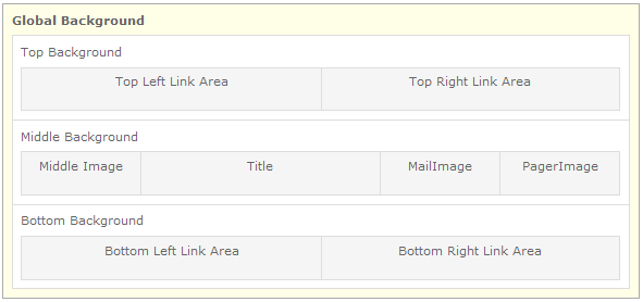
Navbar templates are divided into twelve style panels that control the look and feel of different components of the template. Depending on your design, you do not need to set styles for all ten panels and you do not need to define each style within a panel.

Navbar template panels
Use the Global Background styles to define the size of the left and right link areas for your navbar and to apply a background image, color and border for the entire navbar.
Use the Top Background styles to apply a background image, color and border to the top of the navbar.
Use the Top Left Link Area to define the margin, spacing and font face, size and style for links placed in the top left navbar area. You can also specify whether you want to show links as Text Only, Icons Only or Icon and Text.
Use the Top Right Link Area to define the margin, spacing and font face, size and style for links placed in the top right navbar area. You can also specify whether you want to show links as Text Only, Icons Only or Icon and Text.
Use the Middle Background styles to apply a background image, color and border to the middle area of the navbar in which the org unit title, middle image, mail image and pager image appear.
Use the Middle Image styles to add an image to the middle area of the navbar. This image is often used as a return link to My Home, Course Home, your institution's main website or any other URL.
Use the Title styles to define the font face, size, style and alignment for the org unit title that appears in the middle area of the navbar.
Use the Mail Image styles to define where on the navbar the mail images appear if they are used. You can upload a custom mail image or alert mail image if desired. The mail image is a clickable image that takes individuals to their email. The mail alert image lets individuals know they have new mail (it also links to the individual's email).
Use the Pager Image styles to define where on the navbar the pager images appear if they are used. You can upload a custom pager image or alert pager image if desired. The pager image is a clickable image that takes individuals to the Pager tool. The pager alert image lets individuals know when they receive a page (it also links to the Pager tool).
Use the Bottom Background styles to apply a background image, color and border to the bottom of the navbar.
Use the Bottom Left Link Area to define the margin, spacing and font face, size and style for links placed in the bottom left navbar area. You can also specify whether you want to show links as Text Only, Icons Only or Icon and Text.
Use the Bottom Right Link Area to define the margin, spacing and font face, size and style for links placed in the bottom right navbar area. You can also specify whether you want to show links as Text Only, Icons Only or Icon and Text.